
Winter offers the perfect excuse to refresh your home’s interior with festive December color palettes that shape moods, tell stories, and create a welcoming atmosphere.
December paint colors can harmonize beautifully with various interior design schemes, from rustic and traditional to modern and minimalist. Deep reds and greens amplify the holiday spirit in a living room, while muted whites and cool blues bring winter calmness to bedrooms and bathrooms. Metallic accents, like gold or silver, add the right touch of elegance.
The execution is every bit as critical as the paint color. Are you creating an accent wall that steals the show, or going for a full-room transformation? Do your lighting and furnishings complement or clash with your selected shade? How will the paint finish (matte, satin, or gloss) affect the room’s personality?
In this post, we’re sharing our favorite holiday-inspired hues.
December’s Top Colors & What They Represent
Here’s what this December’s trending shades represent and why they’re perfect for updating your space:
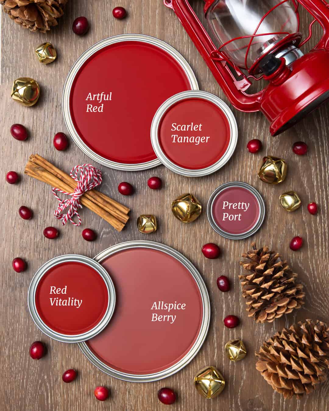
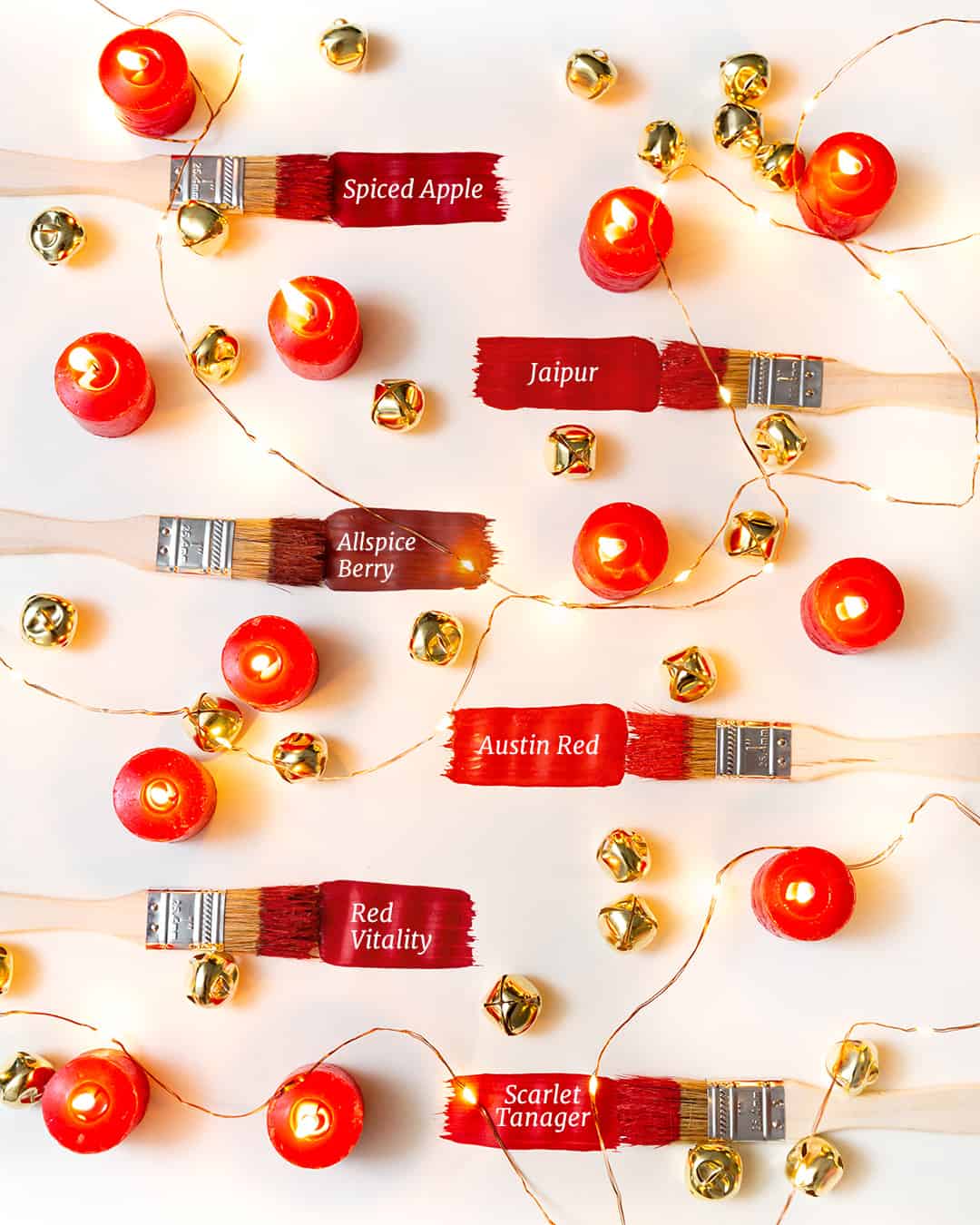
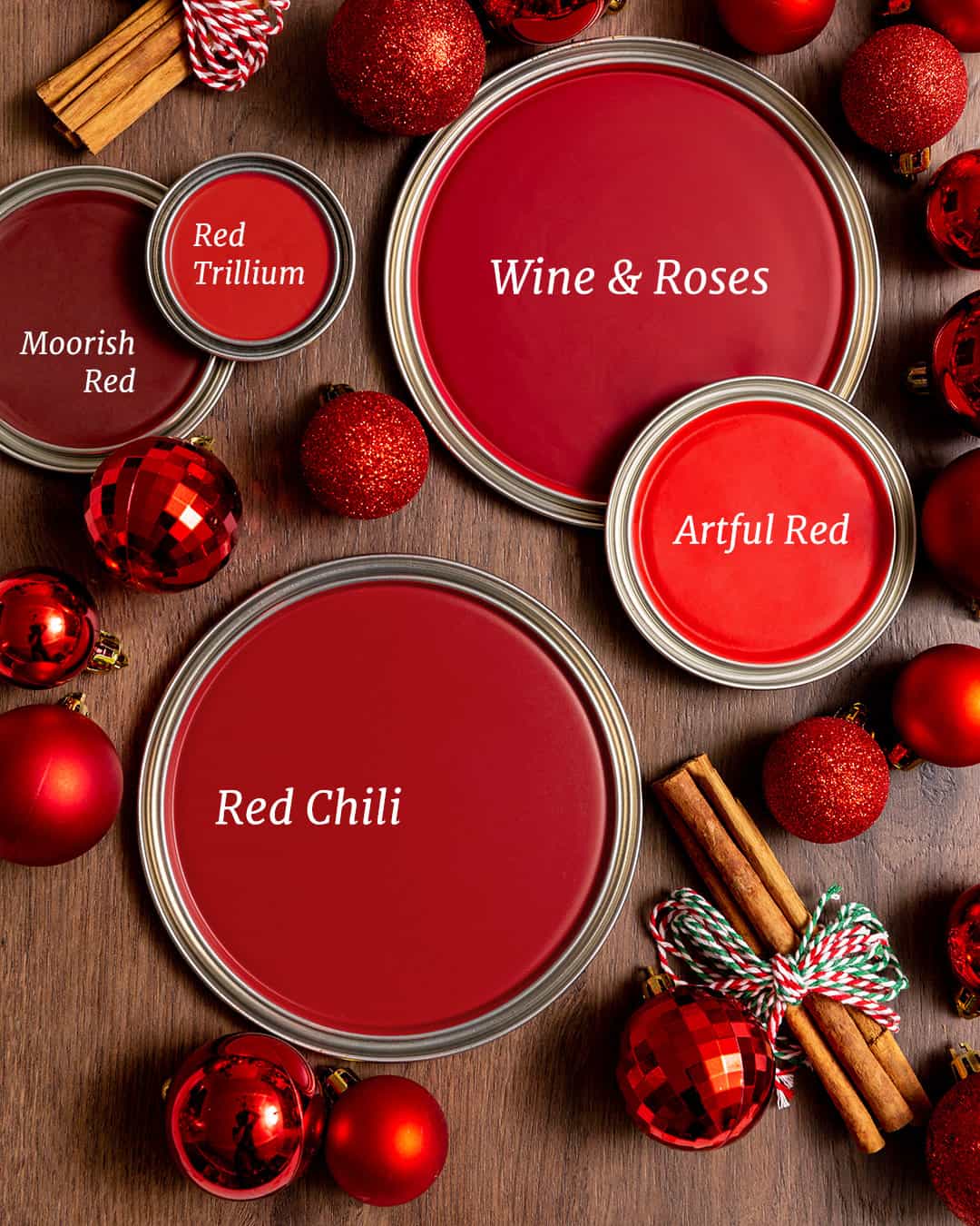
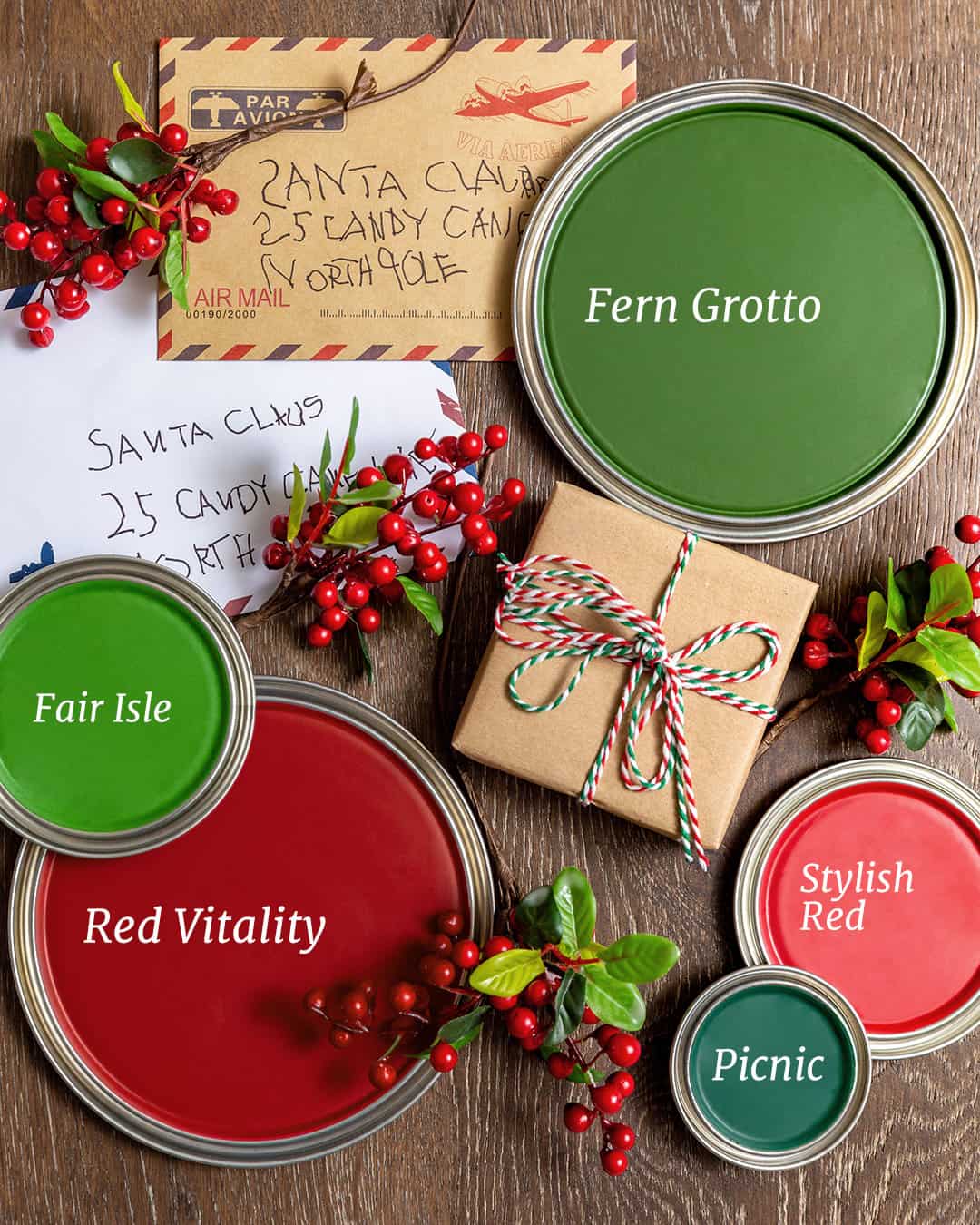
1. Rich Reds
- What they represent: Passion, warmth, and holiday cheer.
- Where to use them: Living rooms, dining rooms, or an accent wall in a cozy nook.
- Pro tip: Pair deeper reds like cranberry or ruby with neutral tones to avoid overwhelming the space.
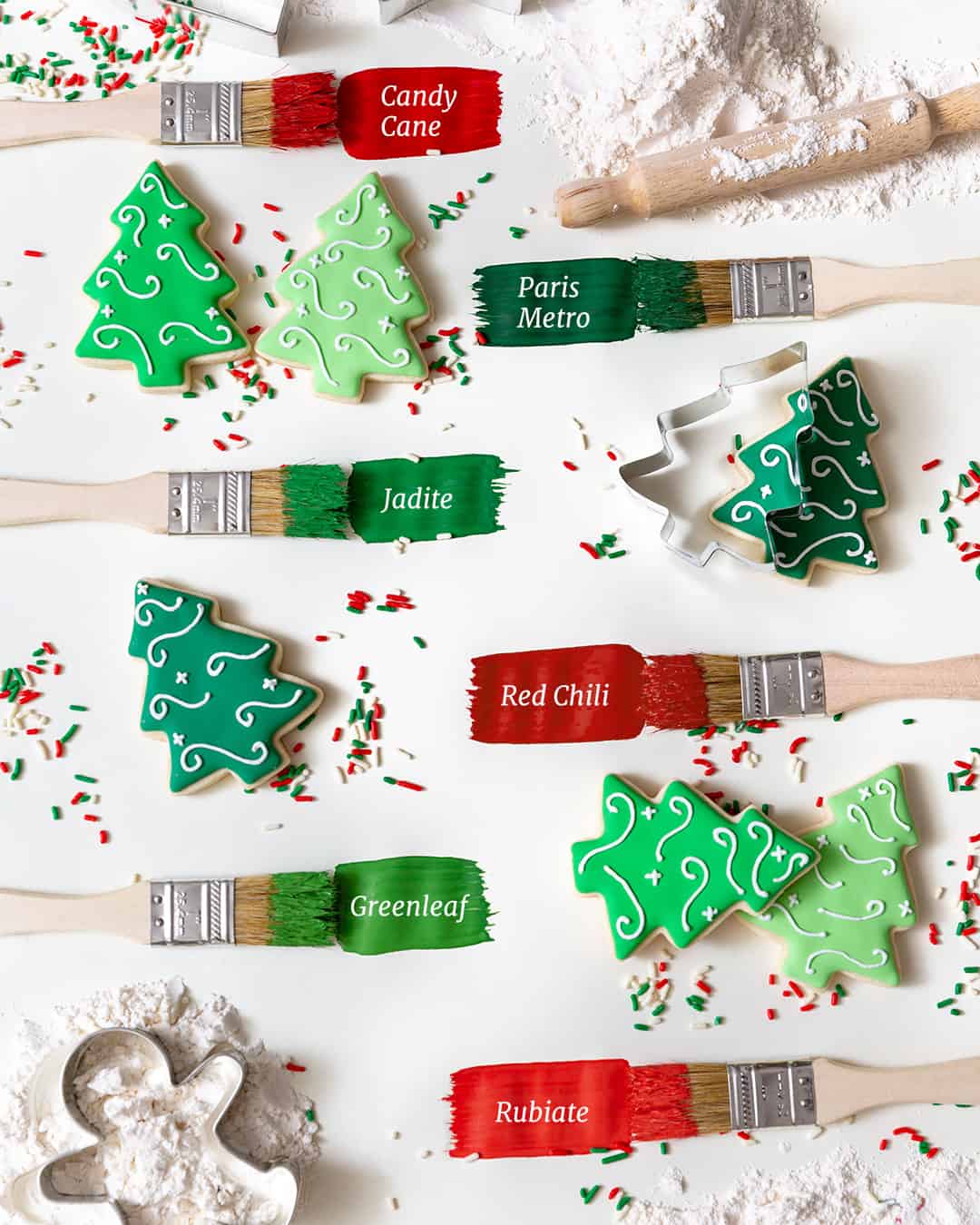
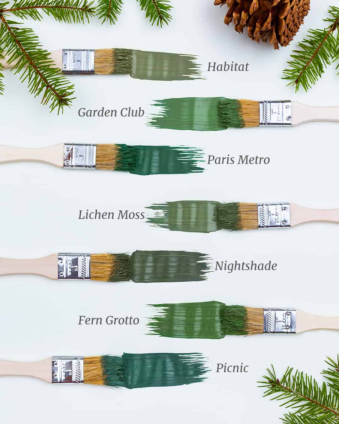
2. Evergreen Hues
- What they represent: Nature, growth, and serenity.
- Where to use them: Kitchens, bathrooms, or decor highlights (think cabinets or shelving).
- Pro tip: Try sage green for an earthy feel or deep forest green for a dramatic touch.
3. Snowy Whites
- What they represent: Purity, simplicity, and renewal.
- Where to use them: Bedrooms, bathrooms, or entryways for a clean, classic look.
- Pro tip: Combine matte white walls with gold or brass finishes for timeless elegance.
4. Icy Blues
- What they represent: Calm, tranquility, and the magic of winter frost.
- Where to use them: Bathrooms, reading corners, or ceilings to create visual breadth.
- Pro tip: Pair with metallic accents like silver for a chic frosted effect.
5. Golden Metallics
- What they represent: Opulence and celebration.
- Where to use them: Accent walls, trimming, or decorative highlights.
- Pro tip: Use sparingly! Golden accents work best when applied in moderation.
Coordinating December Colors with Interior Design Schemes
How can you harmonize your selected colors with your existing interior design?
- Traditional Styles: Use a palette of reds, greens, and cream tones to invoke a classic holiday feel. Layer these colors with textured elements like plaid throws or wooden furniture for warmth.
- Modern Minimalism: Opt for icy blues and whites to create a serene, uncluttered environment. Add contrast with bold black furniture or silver accents for a touch of sophistication.
- Rustic Chic: Evergreen hues paired with natural wood tones (walnut, oak) can turn any room into a cozy retreat. Incorporate greenery for added texture.
- Eclectic Designs: Mix it up! Use bright reds or gold metallics as statement colors while blending different textures, patterns, and furniture styles.
Are you painting your home this holiday season? Tag us on Instagram and share your experience with us!