Over the last decade, “farmhouse” has become one of the more popular design trends and styles. I also think it’s become a style that is popular to make fun of and criticize because of the way that decor has been represented and people have interpreted this trend. From cheesy signs with random sayings to galvanized metal and burlap, this style has really gotten away from what it ultimately represents and has increasingly become a style that often feels a bit kitschy and costumey.
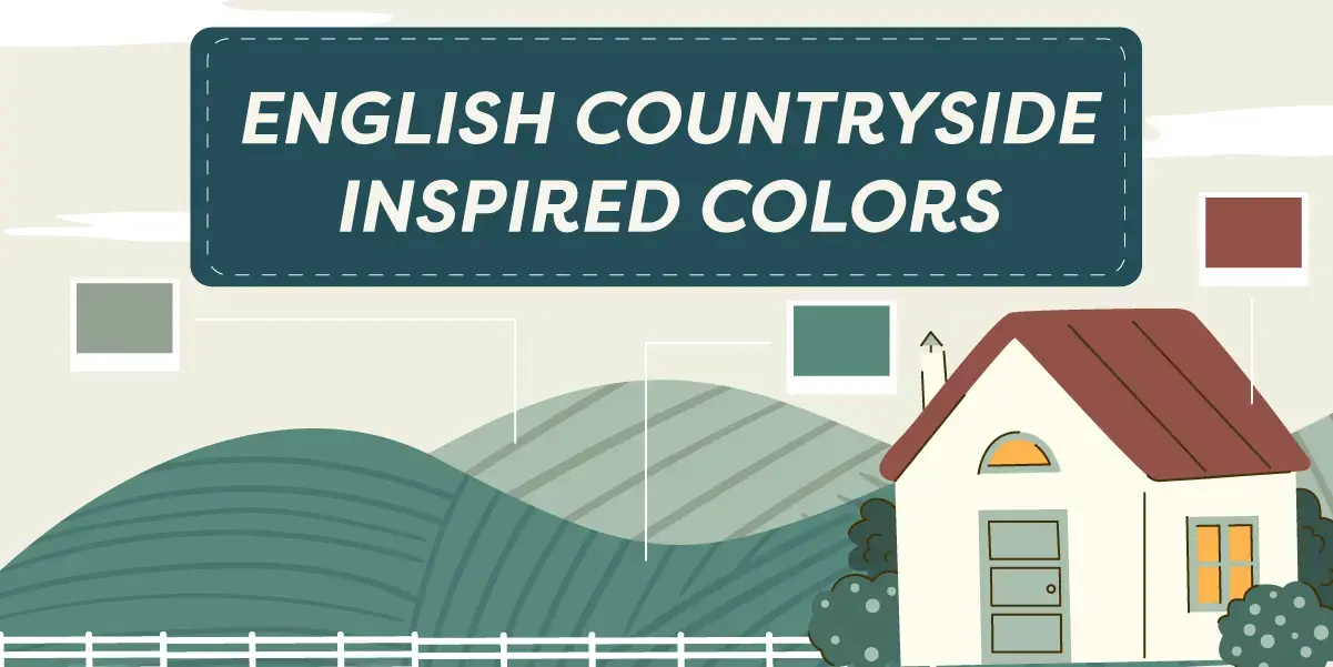
Farmhouse Style: From Classic to Kitsch
“Farmhouse” has essentially gone from a style rooted in great inspiration to white walls with shiplap. While I firmly believe that you should always do whatever you want and like when it comes to design, I do think that there are other directions that “farmhouse” can go in that lends itself to a very beautiful design and something that feels more elevated and timeless.
I think that “farmhouse” style started out with good intentions, and that its origins are referential to designs and things that are quite lovely and full of character. From hearty materials, such as brick, stone, and warm woods, to paint colors that compliment the land that these farms inhabit, it makes sense why this picturesque setting became an idealized design trend and style.
Sheep grazing in an English meadow.
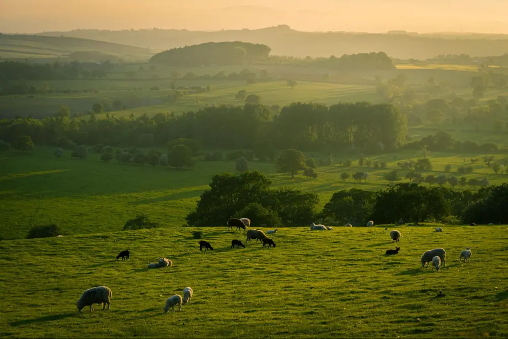
When I think of farms and a more rural setting, the English countryside is always the first thing that comes to mind. From little cottages made from natural stone found on the land and thatched roofs to rolling hills popping up during a foggy morning or animals grazing in the fields, I think this is where the heart of “farmhouse style” comes from. One movie that I constantly return to “farmhouse” design inspiration is Pride and Prejudice.
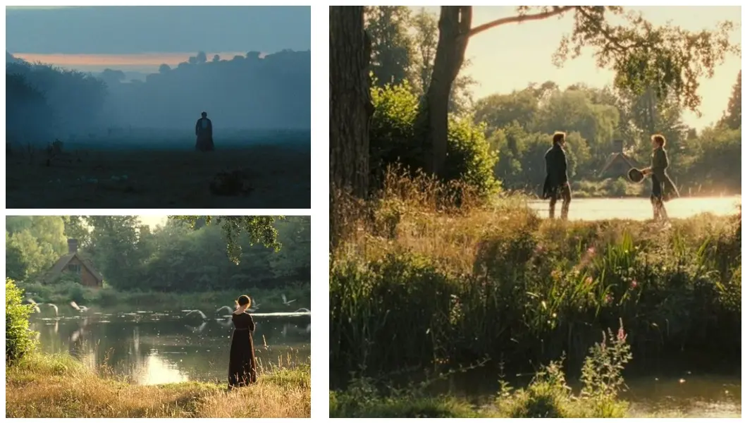
Scenes from the 2005 film, “Pride and Prejudice.”
Every shot of this film is beautiful. Whether it’s a cool morning or as the sun begins to set, I am always mesmerized by the set design and color grading of this movie. To me, “farmhouse” represents a time when homes were built with quality materials. When we took pride in our environments and respected the nature around us, instead of just trying to create the next trendy thing or style.
It represents hard work, but also slowing down to enjoy life. I also enjoy looking at paintings of the English countryside for inspiration and seeing what colors artists used and how they represented this beautiful landscape in their work.
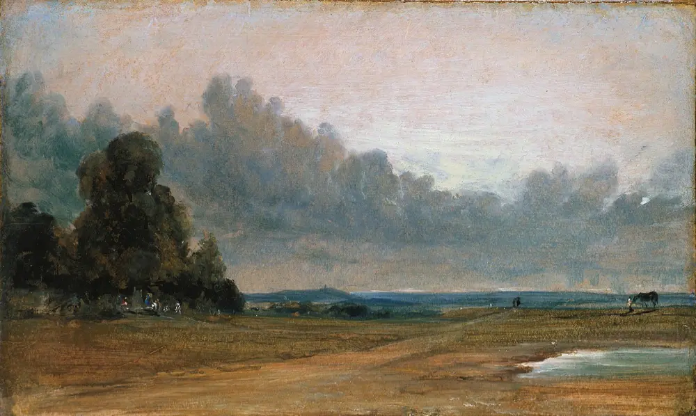
John Constable – A View on Hampstead Heath with Harrow in the Distance
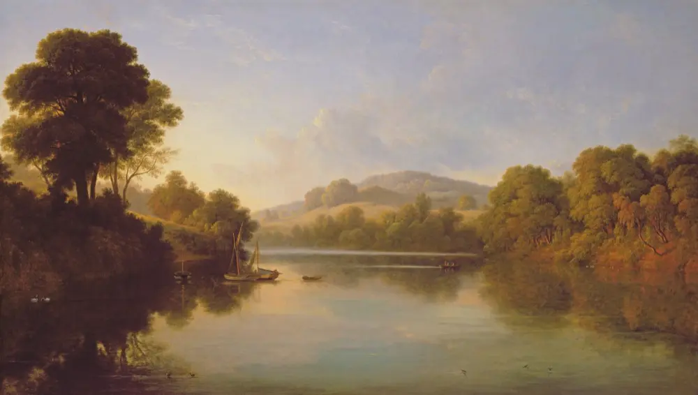
John Glover – Great Barr, Staffordshire
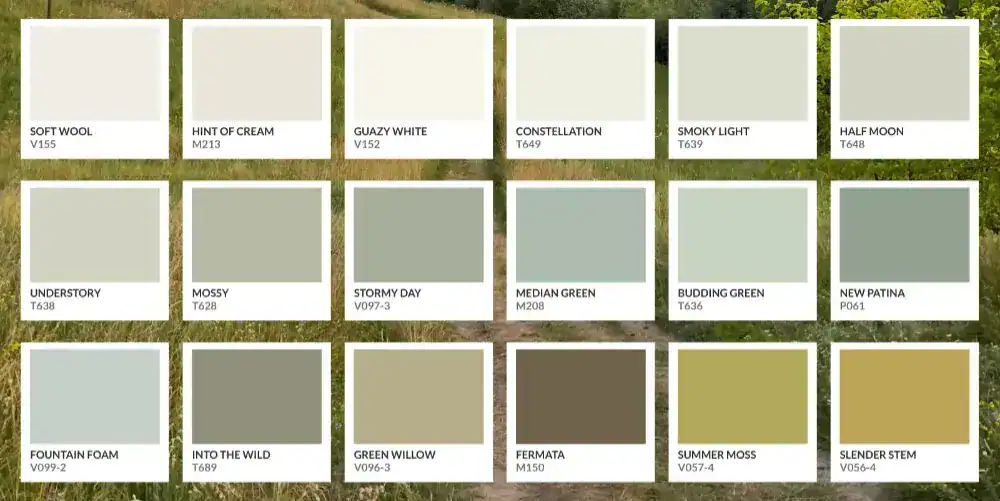
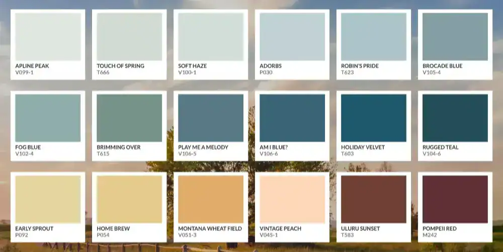
The Warm Palette of the English Countryside
Early on in my career, I realized that the paint colors I am most drawn to are spaces that make use of cool and warm tones. I think it’s this contrast of muddier colors mixed with accents of cooler tones that evokes one of my favorite feelings in a space– relaxation.
There’s something quite serene and emotive about these pieces of art and the movie stills that draws me, which is something I enjoy achieving from the spaces I design. Upon further reflection, I realized that these colors are often what makes up the landscapes of the English countryside.
If this style resonates with you too, then I hope you try to bring in elements of it into your own home or space. If paint is what you’re looking for, then below are some paint colors from Valspar that represent this wonderful version of “farmhouse style.”