Picking a paint color can certainly be an overwhelming task. . . even for a designer. What seems like a simple process is actually a lot more complicated. Through years of trial and error, we’ve created a foolproof process for picking paint colors. We’re sharing what we’ve learned along the way in the hope that it helps you make the right color choice for your space.
STEP 1: WHAT’S THE VIBE?
What’s the vibe you’re going for? Bright, moody, neutral, sophisticated, earthy, playful, cool, calm? Look on Instagram and Pinterest to pull visual inspiration for your creative ideas .
Simple & Airy
Playful
Eclectic
Cottage
Dark & Bold
Neutral & Timeless
Earthy
Cool & Calm
Fun & Punchy
Cheerful & Bright
STEP 2: WHERE DO YOU WANT THE COLOR(S) TO LIVE?
In any given room, there are other paintable elements to consider than just the walls. There are the baseboards, crown molding, door trim, window trim, door(s), closet door(s), and any other millwork that resides in that space (cabinets, furniture piece, etc.). Take a moment to map out the space and how you want it to look. That way when picking out colors and looking at paint chips you know what areas you’re planning for.
Contrasting Trim & Doors
All One Color As the Main Event
Painted Millwork & Different Colored Walls
STEP 3: IGNORE TRADITIONAL PAINT COLOR RULES
When it comes to picking a paint color, we don’t believe in having rules. Instead, we believe in giving ourselves the freedom to figure out what we want to achieve out of a space and how different elements can best support that through the design.
Picking a color is a journey and as with all journeys, there are different routes and courses. Just how no two clients are the same, neither are the rooms. One color that worked great for one project might not be the right fit for another.
Reading articles and posts about the “best white paint colors” or “best green paint colors” is a great place to start since it helps narrow down the many options that are out there, but don’t just take that information at face value without consideration to your specific space and design goals. We also recommend being wary of any articles telling you “what not to do” or “what not to paint your space.” Usually those rules and advice aren’t accurate or always grounded in facts.
At the end of the day, it’s not about what everyone else likes or is trending. . . it’s about what you like. Your home and spaces should be a reflection of you and your family, not others. Who cares what someone else thinks, as long as you like it!
For example, you’ve probably heard the general rule when it comes to painting – that a bright white room will make it seem bigger and open, offering a blank canvas for all the other elements you want to bring into a space. Or that painting a smaller space dark without a lot of natural light will make it appear even smaller and claustrophobic. Well, that’s actually not true. It’s one of those misconceptions that began circulating years ago and really stuck.
In fact, the opposite is true. According to a study from Sherwin Williams, “people perceive bright objects to be nearer than the same objects in darker colors.” Meaning that darker colors actually create the perception of receding. So if you want to paint a room dark or a color other than white, go for it! It won’t impact how you perceive the size of a space.
Now, that’s not to say we don’t also enjoy white walls, just that we try not to limit ourselves out of fear of breaking “rules” or to make sure we’re on trend. A smaller space like a powder bath or pantry is a fun spot to do something unique and different. It can be less overwhelming than an entire living room and gives you room to play and try new things.
STEP 4: CONSIDER THE UNDERTONES & LIGHTING
Even picking something as simple as white isn’t always straightforward. What type of white? A warm white, a cool white, a creamy white, a white-white? Too warm, and it looks yellow; too cool, and it looks blue or gray; too creamy, and it looks beige.
The direction of the natural light in a space and how much natural light there is, will impact how you perceive a color, not the actual size of a room.
- North-facing windows, even when there’s a lot of natural light, casts more of a cool-toned hue.
- East-facing windows have more direct light in the morning and fade into a more muted, indirect cast later in the day. Eastern exposed natural light leans more on the cool end of the spectrum.
- South-facing windows tend to cast a warmer tone.
- West-facing windows have indirect light in the morning that gets more dominant in the afternoon. Western exposed natural light will be warmer.
In addition to the natural light, take note if there are any trees that block the sun, an overhang, roofline, neighboring buildings, etc.
STEP 5: THE POST-IT SELECTION METHOD
Before swatching a bunch of samples directly on the wall, try to narrow down your selection to about three – five options. This makes the decision process a lot easier.
To help us narrow down our choices, we’ve developed a process we like to call The Post-It Method.
Pick Out Color Chips
Go to your local Anawalt store and pull paint chips. Don’t limit yourself. This is the step when you can be as bold and out there as you want. Consider all the options, you never know what you might like until you get the chips home.
Keep in mind that the lighting is going to be a lot different in the store than it will be in your home, so give yourself enough variety. If something seems too dark or too light, give it a chance because it might surprise you once you have it up in your actual space.
Hold the Colors Up, Not Down
Tape the paint chips on the wall (or wherever you want that color to live: door, window trim, etc.).
When looking at the colors make sure you hold them up, not down. That’s one of the biggest mistakes we see people make. Remember that you are never going to be looking down at the paint color so if that’s how you are viewing and narrowing down your options, it’s not going to be an accurate portrayal. This is where lighting really comes into play — how light reflects off a wall vs. looking down at a paint color.
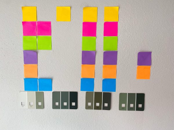
Get 4-6 Post-Its in Different Colors
This helps take the guesswork out of the process. Take your 4-6 post-its and designate a time of day for each color. We recommend: early morning, late morning, early afternoon, late afternoon, evening, night. Set an alarm on your phone for those times.
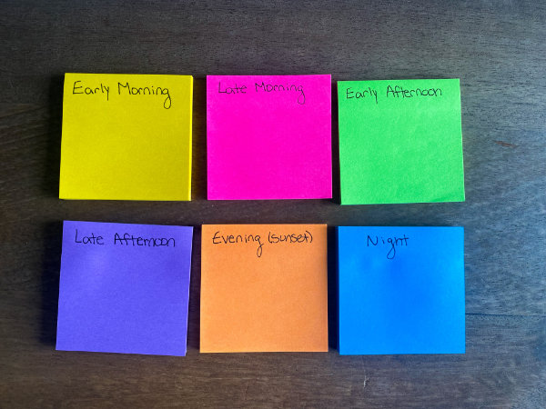
When your alarm goes off, go look at the colors and put the corresponding post-it next to the colors you like at that specific time of day.
Then, once you’ve done this 4–6 times, whichever colors have the most post-its move onto the next round. The next day, tape the colors to another wall and repeat the process. If you are still left with more than three – five options, repeat the process with what you’ve narrowed it down to until you have no more than five colors.
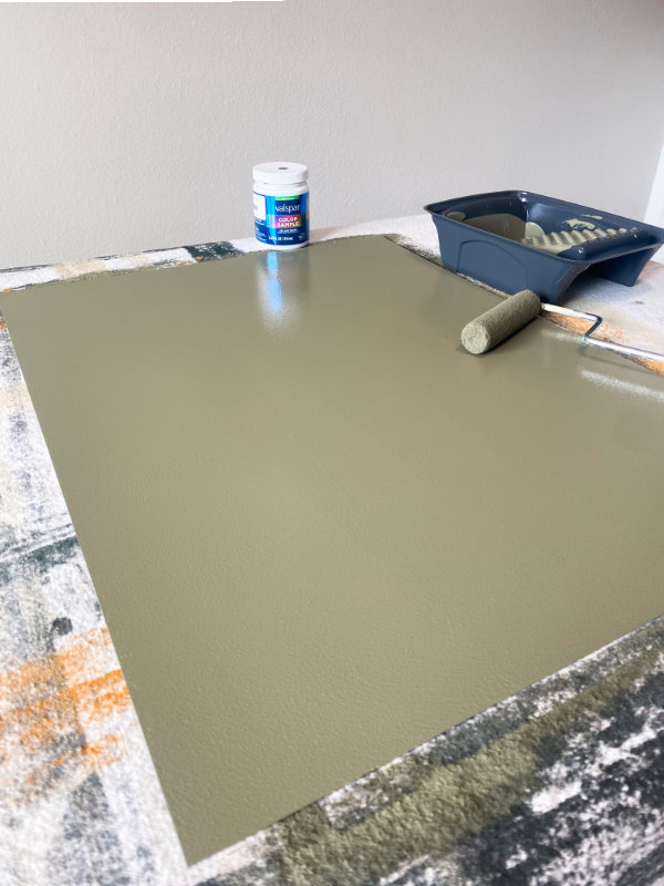
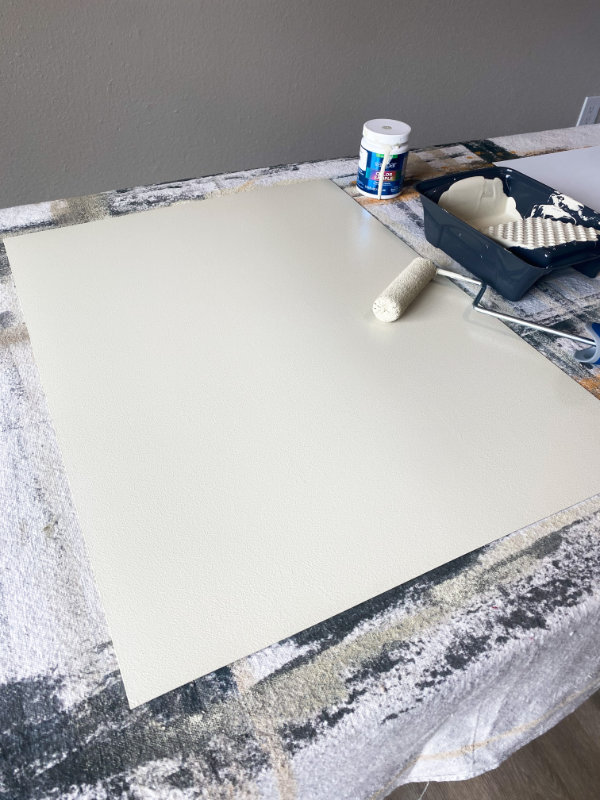
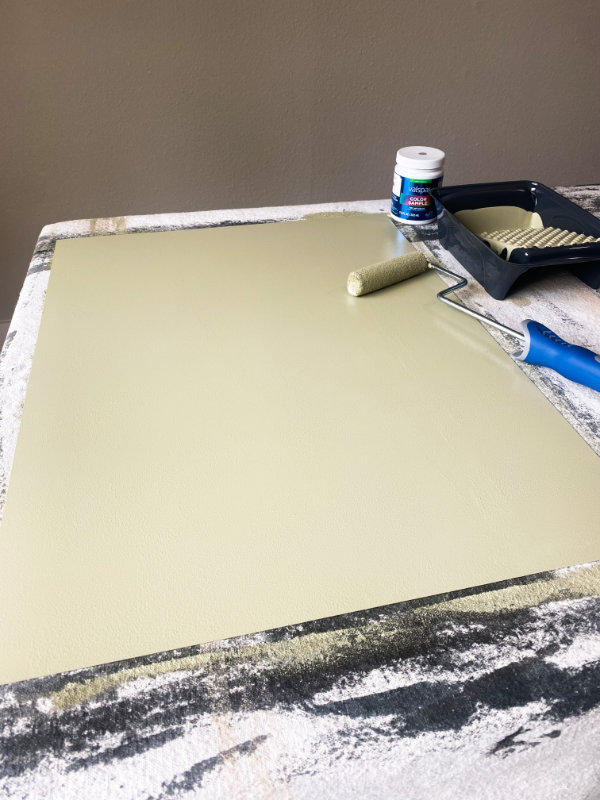
STEP 6: TEST THE PAINT COLORS
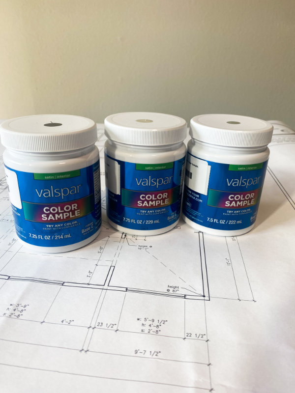
Now that you have your top three – five colors narrowed down, you can swatch samples directly on the walls or use our preferred method, which is to paint samples onto a product called Mighty Boards. We like the flexibility of Mighty Boards since we can move the colors around the space without having to swatch on a bunch of walls, while still seeing the color in a large format. As a designer, this also allows us to catalog colors and bring the boards to future job sites and projects.
We put the three boards on the wall and repeat the Post-It Method.
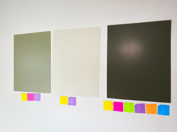
From there, we will narrow down our options to 2–3 colors (sometimes 1) and paint those swatches directly on the wall. We again repeat the Post-It Method, which leads us to our final choice.
In this example, we clearly favored this dark green color (Cosmopolitan Olive), and felt confident moving forward with painting the walls without swatching directly on the wall itself. If we weren’t sure or still felt undecided, we would have swatched directly onto the wall itself to help us with our decision.
STEP 7: PICK A FINISH
The final thing to determine once you have your color selected is a finish.
A satin finish is always a great choice if you have kids and pets, since you can easily wipe it down. If you’re painting your space in all one color, we recommend painting the walls in a flat finish and all your trim work in satin so that you can easily dust and clean the millwork. A high gloss finish is transcendent of style– modern or traditional. It all comes down to application and intention.
Keep in mind that different finishes can slightly alter the hue of a color. A higher gloss finish is going to be more reflective of light, whereas something more matte will absorb light.
Our best advice when it comes to the actual painting process is to spend time doing the prep work. Painting is 85% prep work and 15% actual painting. You can have the most beautiful color in the world, but if you don’t take the time to properly prep your walls and millwork it will really affect the application.
Picking a paint color is a journey. There’s no such thing as the perfect universal paint color. But there is the perfect color for you. That’s what makes it right and special.
The most important thing to remember is that it’s okay if you don’t get it right the first time. As frustrating as it is, at the end of the day it’s only paint. Mistakes happen and use it as a learning experience. Paint can always be fixed and changed.
We find it hard too and have definitely made mistakes throughout our careers and had to correct color decisions that we thought were the right choice, only to realize we were very wrong once it’s already on all the walls.
Be patient, take your time making a decision, don’t be afraid to do something different from what is trending at the moment, and go with your gut.
FAQs: Choosing a Paint Color
Q: How long should I let the paint dry before applying a second coat?
Typically, paint should dry for about 2 to 4 hours before applying a second coat, but this can vary based on the type of paint and environmental conditions. Always check the manufacturer’s recommendations for drying times.
Q: Is it necessary to prime my walls before painting?
Priming is highly recommended, especially if you’re painting over a dark color, painting new drywall, or using a different paint type (like switching from oil-based to water-based). Primer helps the paint adhere and can improve the final appearance.
Q: How do I choose a color that matches my furniture and decor?
Begin by identifying key elements in your room, such as furniture and textiles. You can extract colors from larger pieces, artwork, or accessories. Use color theory to select shades that harmonize with these elements – for example, complementary and analogous colors.
Q: What are some good color combinations for different rooms?
For a calming bedroom, consider soft blues or greens paired with warm neutrals. Yellows or reds work well alongside white or grey finishes in a vibrant kitchen. Earthy tones complemented by rich accent colors can add depth to living rooms.
Q: Can I use the same color throughout my entire home?
A cohesive color throughout your home can create a sense of unity. Try varying the shade by using lighter tones in smaller or more intimate spaces. Additionally, different finishes can heighten visual interest in each room while maintaining a common palette.
Q: How can I assess the quality of paint before purchasing?
Quality paint typically has better coverage, durability, and longevity. Look for brands that offer warranty information and read reviews. Consider the paint’s VOC content, which can affect indoor air quality and overall safety.
Q: What should I do if I don’t like the color once it’s on the wall?
Don’t feel discouraged. You can repaint or try using a lighter or darker tint of the same hue to create a new atmosphere. Paint is an opportunity for experimentation and can always be adjusted.