
Sometimes, the simplest and most affordable design solutions have the biggest impact.
Paint is one of the easiest and cheapest ways to transform a home.
- Light paint colors reflect more light, making a room feel larger and airier. Developers use this trick in staging homes for sale.
- Colors like red, orange, and yellow stimulate appetite and energy. Fast food chains exploit this in their branding.
- Painting the ceiling a darker color than the walls can create a sense of intimacy, while a lighter ceiling makes a room seem taller and more open.
- Cool colors are calming in bedrooms or bathrooms. Warm tones evoke energy and social warmth.
- Rooms painted in warm tones can “feel” warmer than rooms at the same temperature but painted in cool colors.
So, where do you start? It’s the paradox of choice — too many options can be paralyzing.
Therefore, we’ve compiled a list of twelve engaging and elegant interior paint ideas for kitchens, dining rooms, living rooms, bedrooms, and bathrooms to help you narrow things down.
1. Accent Walls for Bold Statements
An accent wall adds depth and personality. Pick a bold, contrasting color for one wall while keeping the others neutral. For instance:
- Living rooms: Use rich navy or emerald on a wall behind the sofa for sophistication.
- Bedrooms: Choose a deep maroon or slate blue for the wall behind your bed’s headboard to create an intimate vibe.
Pro Tip
Stick to darker shades for cozy rooms, or lighter hues for a more expansive feel.
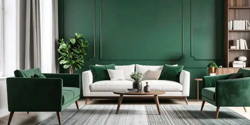
An accent wall adds depth and personality to a living room, dining room, or bedroom.
2. Two-Tone Walls for Visual Interest
Divide the walls into two sections and paint each in a contrasting color. This technique adds dimension, and it is often seen in dining rooms or kids’ rooms.
- Pair white with a pastel shade like blush pink or sage green for timeless elegance.
- A bolder option? Try charcoal gray on the lower half and off-white on top.
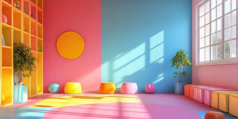
Two-tone walls are a popular treatment for playrooms.
3. Stylish Statement Ceilings (“The Fifth Wall”)
Ceilings are the most overlooked surface in home design. Make them as stylish as the rest of your home with these tips:
- Paint ceilings a bold color, such as deep blue or emerald green, to add drama and interest.
- Instead of paint, consider using wallpaper on the ceiling for a unique look.
- Create texture by covering the ceiling with wood planks or beams.
Pro Tip
Keep the ceiling lighter than the walls for smaller rooms to maintain openness.
Dark ceilings with bold colors can add drama to a room.
4. Stripes for Energy
Horizontal or vertical stripes create visual movement in a room.
- For narrow hallways: Horizontal stripes can make space feel wider.
- For tall ceilings: Vertical stripes visually elongate walls.
Stick to two neutral colors, like taupe and white, for classic styling, or mix bold colors for a playful look.
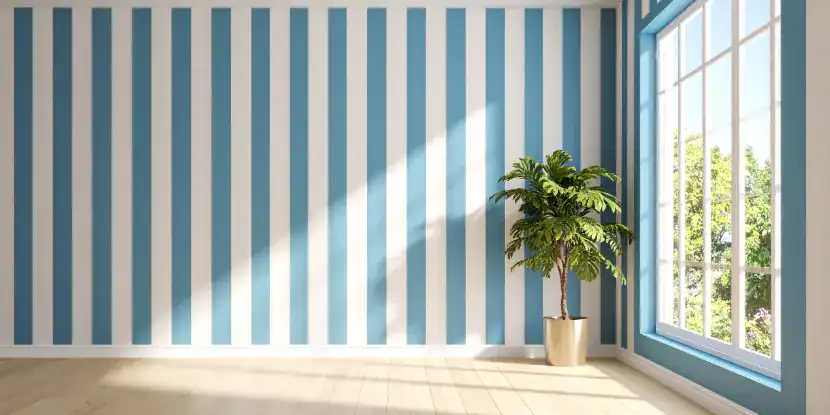
No, we haven’t joined the circus. A room with vertical stripes can feel taller and more energetic.
5. Ombre Walls for Subtle Elegance
Ombre walls seamlessly transition from one color to another, creating a gradient effect.
- For a serene bedroom, fade from pale blue at the top to white near the floor.
- Sunset tones (orange, pink, and yellow) work beautifully in bathrooms.
Pro Tip
Hire a professional or use sponges and blending brushes for smoother gradients.
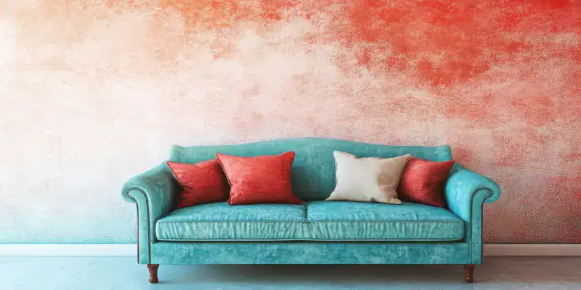
Ombre paint treatments done well can be elegant and dramatic. Done badly, they’re a mess!
6. Color Blocks for Contemporary Flair
Create geometric patterns using tape instead of full-wall coverage with a single color.
- Triangles or rectangles in pastel tones for kids’ rooms.
- Two overlapping squares of blue and peach for visual interest behind a couch.
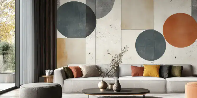
Create geometric patterns using tape masks for visual interest and contemporary flair.
7. Distinguished Tuxedo Kitchens
The “tuxedo kitchen” uses light and dark colors for cabinets. Muffy the tuxedo cat will approve. Every kitchen venture becomes a black tie affair!
- Paint the lower cabinets navy or black and the upper cabinets white or cream.
- This creates contrast and polish without overwhelming the space.
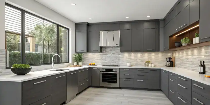
Muffy will approve of your tuxedo kitchen with dark gray cabinets.
8. Contrasting Trim & Door Frames
Contrasting paint can turn even the tiniest details into focal points. This approach is for modern homes or boho interiors.
- Try mustard yellow, forest green, or pastel lavender for a bold personality infusion.
- Prefer something tamer? Stick with classic white and black.
- Add metallic touches like gold or copper for a luxury touch.
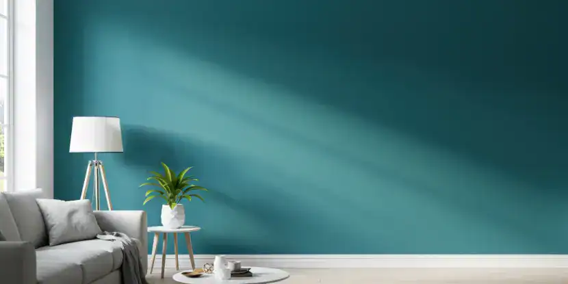
A living room with teal walls and contrasting white trim.
9. Chalkboard Walls for Practical Creativity
Chalkboard paint creates an erasable surface for drawings, lists, diagrams, and reminders and works splendidly in kids’ rooms, kitchens, and pantries.
- Use it to jot down shopping lists or weekly reminders in the kitchen.
- Kids can scribble and draw to their hearts’ content in playrooms.
Pro Tip
Stick to one chalkboard wall to avoid overpowering the space.
Chalkboard paint creates a writable surface for drawings and notes.
10. Colorful Nooks & Built-Ins
Give bookcases or built-in shelves a makeover by painting their interior panels.
- Emerald green or velvety black contrasts against white bookshelves.
- Create a reading nook with calming earth tones like terracotta.

White bookshelves contrast with a charcoal wall.
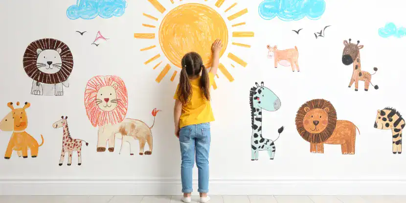
11. Decorative Stenciling for a Custom Look
Add whimsy to your walls by stenciling a pattern or design.
- Create a botanical or floral theme on living room walls for a fresh vibe.
- Stencil geometric patterns in entryways for a modern, welcoming ambiance.
- Create an accent wall with a bold, geometric stencil.
Pro Tip
Use removable wallpaper instead of permanent paint for easy changes in the future.
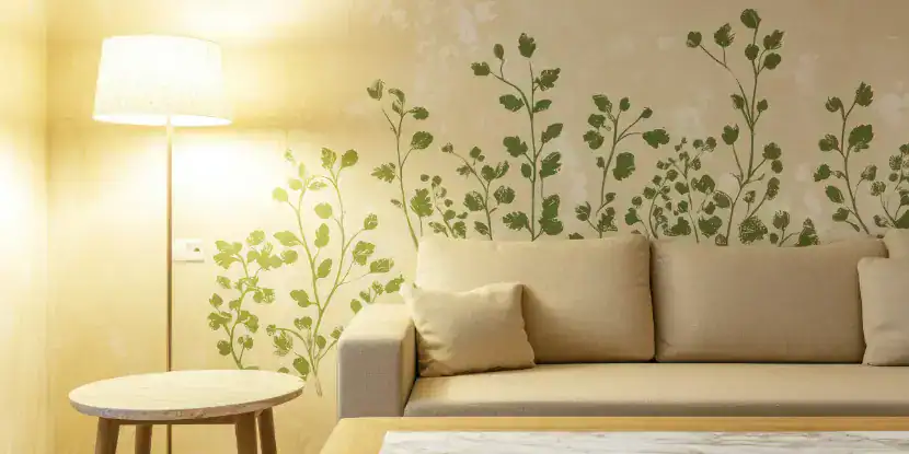
A botanical or floral theme on a living room wall creates a lively, fresh vibe.
12. Metallic Accents for Luxury
Metallic paints elevate a room’s aesthetic. Apply them in smaller areas like bathrooms or as accents in larger spaces.
- Add gold or silver brushstrokes over deep base colors for a moody vibe.
- Outline molding or corners with a fine metallic band for a polished detail.
Metallic paints elevate a room’s aesthetic. Apply them as accents in larger spaces
How to Start Your Interior Paint Project
Feeling inspired? First things first. Here are the steps you should take before you pick up a paintbrush.
- Test colors: Grab paint samples and try swatches on your walls.
- Invest in quality paint: High-quality paint ensures better coverage and durability.
- Prepare your walls: Clean surfaces, patch holes, and tape off edges for crisp lines.
Consider reaching out to a professional for a flawless finish for complex designs like ombre or metallic accents.
FAQs: Interior Paint Design
Q: How do I choose the best paint colors for my home?
Consider the room’s lighting, furniture, and mood. Warm tones like yellows and reds energize, while cool tones like blues and greens calm.
Q: Is matte or glossy paint better for walls?
A matte finish can hide imperfections, while glossy finishes are durable and create a reflective shine ideal for trims or accent details.
Q: Can I use multiple designs in one home?
Yes, but maintain cohesion! Stick to a unifying color palette to ensure the styles flow from room to room.
Q: How can I make small rooms feel larger with paint?
Use lighter colors on walls and ceilings, or incorporate vertical stripes to create the illusion of height.
Q: Are there eco-friendly paint options?
Look for low-VOC (Volatile Organic Compounds) or zero-VOC paints, which are better for your health and the environment.
Q: How often should I repaint interior walls?
Generally, every 5–7 years is a reasonable time frame, but this depends on wear and paint quality.
Q: How can I match my furniture and decor with my paint colors?
Select an anchor piece (like a rug or artwork) and match hues within for a harmonized look.
Q: Should I hire a professional painter?
Hiring a professional ensures precision and saves you time if you’re attempting intricate designs (like ombre or stencils) or dealing with tricky areas.