Is it time to lie down or get down?
The color of your bedroom has a surprising impact on the quality of your sleep or, shall we say, more vigorous activities.
- Blue lowers heart rate and blood pressure. People with blue bedrooms often get the best sleep.
- White is crisp and clean but can feel stark if not warmed up with textiles and accents.
- Red evokes passion and energy. Too intense for rest, it can raise adrenaline levels. Is this what you had in mind?
Color psychology plays a role in your choice of bedroom paint, whether deliberate or subconscious. Here’s how to align your color selection with your goals.
Best Colors for Sleep
Focus on cool tones and muted hues for restful sleep. These shades calm your mind and prepare your body for shut-eye.
1. Blue
Why it works
Blue reduces stress and promotes tranquility. Studies show bedrooms painted in soft blues help regulate sleep patterns.
Best shades
- Light sky blue for openness.
- Muted navy for a cocoon-like feel.
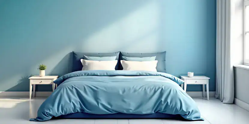
Are you a fitful sleeper? Try blue paint in the bedroom to calm the nerves.
2. Soft Green
Why it works
Green is associated with nature. It brings balance and relaxation without feeling cold.
Best shades
- Sage green for a soothing, earthy vibe.
- Mint green for a fresh yet tranquil look.
3. Lavender
Why it works
This pale purple hue combines the serenity of blue and the warmth of red, casting a peaceful, dreamy atmosphere.
Best shades
- Dusty lavender for elegance.
- Soft lilac for light, airy vibes.
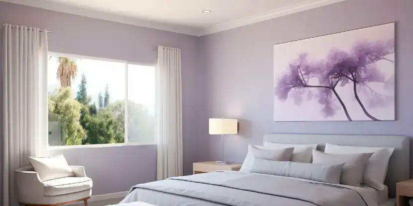
Lavender paint creates a peaceful, dreamy atmosphere.
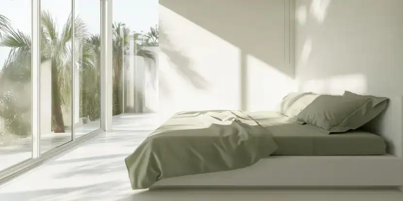
4. Neutral Tones
Why they work
Colors like beige, taupe, or light gray create a soothing, understated backdrop while allowing accessories and furniture to shine.
Best shades
- Warm beige for a welcoming feel.
- Cool gray for a modern, relaxed atmosphere.
Pro Tip: Avoid vibrant or bright versions of these colors, which can overstimulate the senses.
Neutral colors allow your furniture and artwork to shine and exude a sense of class.
Best Colors for Excitement & Energy
The following shades can boost confidence, romance, and even libido. Balance these bold colors with neutral tones to keep the space cohesive and comfortable.
1. Red
Why it works
Las Vegas honeymoon suites often go heavy on the red. That’s no accident — it can boost energy and libido. However, too much red can disrupt sleep, so use it sparingly (unless you want every weekend to be a weekend in Vegas).
Best Uses
- Accent wall behind your bed.
- Pillows, rugs, or other smaller decor items.
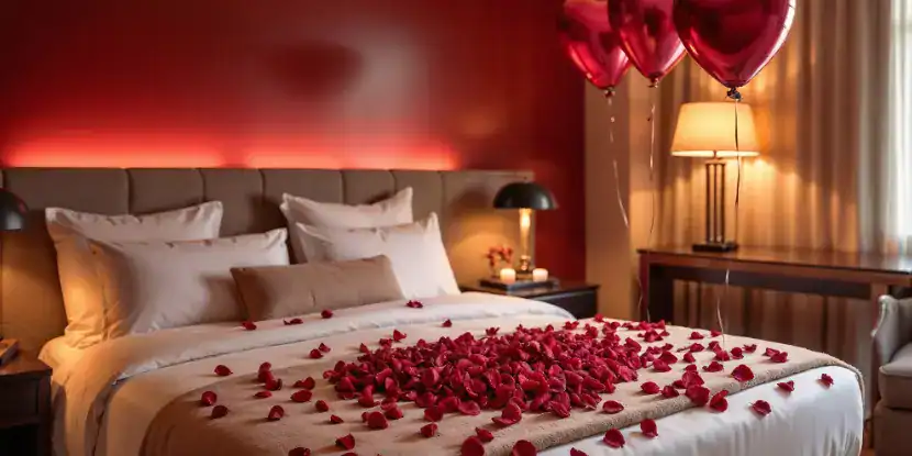
Red paint, red accents, and Barry White on the Bluetooth speaker set the scene for a night of passion.
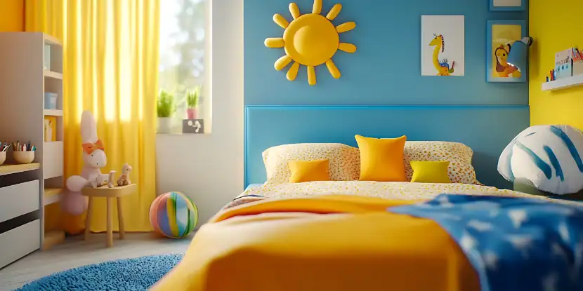
2. Warm Yellow
Why it works
Yellow projects optimism and playful vitality. This cheery color can help you wake up refreshed.
Best shades
- Soft buttery yellow for warmth without overwhelming the space.
- Goldenrod for vibrancy.
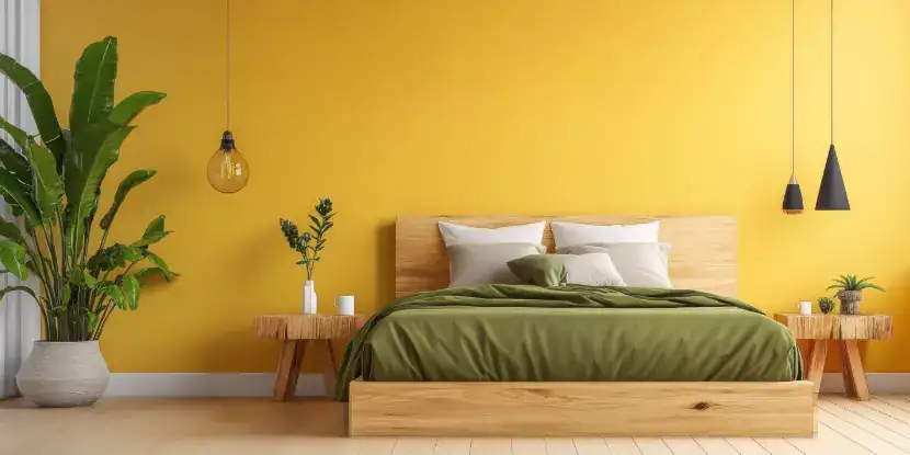
Cheery yellow walls can help you wake up refreshed.
3. Coral or Peach
Why they work
These colors combine the vigor of red with orange’s soft, inviting warmth.
Best shades
- Soft coral for balanced energy.
- Pale peach for a youthful, fresh look.
Coral paint combines the vigor of red with orange’s inviting warmth.
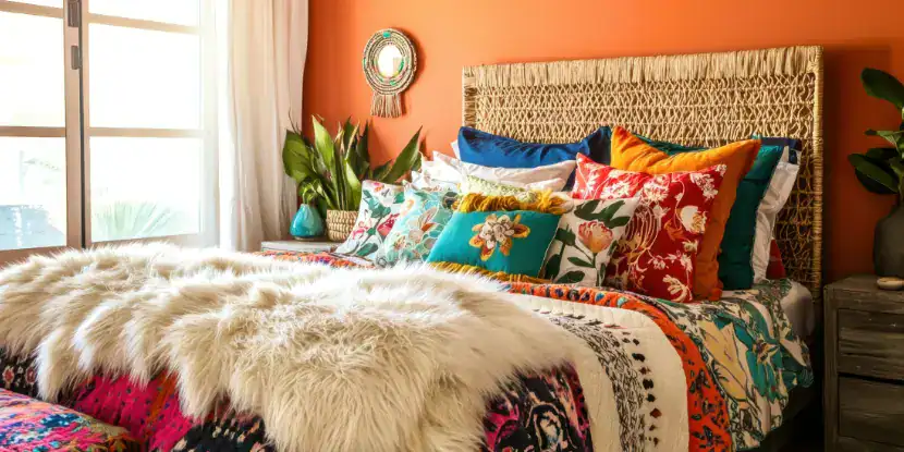
4. Bold Jewel Tones
Why they work
Rich shades like emerald green or royal suggest luxury and drama.
Best uses
- Upholstered headboards.
- Curtains or bedding for a sophisticated color accent.
Rich shades suggest luxury and drama.
Contrasting Walls vs. Same Color Walls
A monochromatic scheme puts forth a very different vibe than a space with contrasting walls. Use matte finishes for restful tones and semi-gloss for lively ones.
Contrasting Walls
- Best for excitement: Paint one wall a bold color (like red or navy blue) to create a focal point, while keeping the others neutral.
- Example: A terracotta accent wall behind the headboard paired with off-white walls.
Same Color Walls
- Best for rest: A uniform color palette in softer tones (like light gray or sage green) fosters a calming environment.
- Example: Pale blue walls across the whole room with white trim for crispness.
Color Psychology by Age Group
Color preferences and reactions often vary by age. Consider these guidelines when designing bedrooms for different demographics:
1. Children
- Choose soft shades of yellow or green for creativity and balance.
- Avoid overstimulating primary colors in large doses.
Children love bright colors, but don’t go too heavy on the overstimulating primaries.
2. Teens
- Deep purples or bold shades of blue can express individuality.
- Consider chalkboard paint for personalization.
3. Adults
- Muted blues, grays, or greens offer tranquility.
- Warm reds or jewel tones enhance romantic vibes.
4. Seniors
- Soft pastels like lavender or beige create a serene atmosphere.
- Avoid stark or overly bright colors that may strain aging eyes.
Seniors may appreciate muted colors that don’t strain aging eyes.
FAQs: Choosing a Bedroom Color
Q: What colors should be avoided in a bedroom?
Bright oranges, neon shades, and intense hues like hot pink can make relaxing and falling asleep harder.
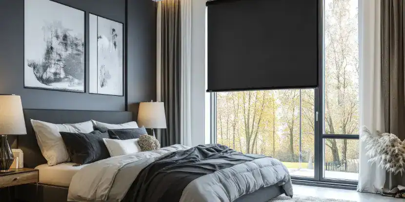
Q: Can I use dark colors in a bedroom?
Dark colors like navy blue or charcoal gray have a cozy, cocooning effect. Balance them with lighter bedding or accents.
Q: Are white walls good for relaxation?
White can feel clean and calming, but may come across as sterile. Pair with warm-toned accessories to add coziness.
Q: Are there colors that can help with morning energy?
Yellow and coral tones bring brightness and vitality, helping you feel refreshed in the morning.
Q: Does color really affect sleep quality?
Scientific studies on color psychology confirm that calming colors (blue, green, etc.) promote better sleep by lowering stress and heart rate.
Q: How do I pick a color if my room gets little natural light?
Opt for soft pastels like light lavender, peach, or airy blues to maximize brightness in darker rooms.
Q: Should bedroom ceiling colors match the walls?
Ceiling colors can match the walls for a seamless look, or remain white for height and openness.
Q: How often should I repaint a bedroom?
Refresh bedroom walls every 5–7 years to keep them clean and modern, or update them sooner if you’re reinventing the space.